


Role - UI/UX Designer
I worked closely with the lead designer to apply a new visual language to all interior pages of the website. I also lead the art direction and user experience for Raab’s online interactive guide.
Tools
Photoshop, Invision
Timeline
Aug 2016 - Sept 2017
The Overview
A clean and polished redesign that provides an elevated experience that honors history
We used a simple color palette, leveraged the beauty of historical documents, and placed historical figures’ signatures into the design to create a feeling of viewing history in the modern world. We also aimed to incorporate opportunities to learn about the selling and buying documents in a fun and interactive way.
The Outcome
Raab’s visual design language didn’t match their white glove-like service
The Raab Collection sells historical documents signed by influential figures including Einstein, Napoleon, Washington, Lincoln, Churchill and our Founding Fathers. They're more than just a seller; they're internationally-recognized experts focused on providing quality and authenticity to the most discerning document collectors. This redesign features a new visual design language and user flow that invokes a white glove-like feeling when experienced online.


The Redesign
My contributions were focused around the site’s improved functionality and visual appeal. Through close collaboration with the creative director and development team, we delivered a modern and responsive design that optimized user experience and engagement. My responsibilities included a refreshed and interactive guide book, interior page designs and layout, and the creation of compelling visual elements across the site that effectively conveyed the Raab’s identity and message. The result was a polished and user-friendly website that, while focusing on the past, was caught up to the present, and is still looking good in its future.

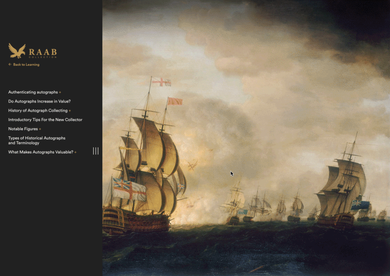
Raab’s Interactive Guide
One section of the website that our redesign targeted was Raab’s historical document guide. This part of the site is a wealth of knowledge about the history of autograph collecting, terminology, authenticating historical documents, and more. The previous design was static, difficult to navigate, and functioned similarly to a table of contents and pages of text.
Adding hierarchy, interaction, and visuals to the information in the guide provided the user more to look at and an easier way to consume the interesting content that was available to them.


Original design


